Hi, I'm Crys!
I am an illustrator and concept designer. I'm adept in illustrative and fine-art work. I can help create your characters or logo and brand. ♡
Project Gallery

Book Jackets

Artwork

Advertisements

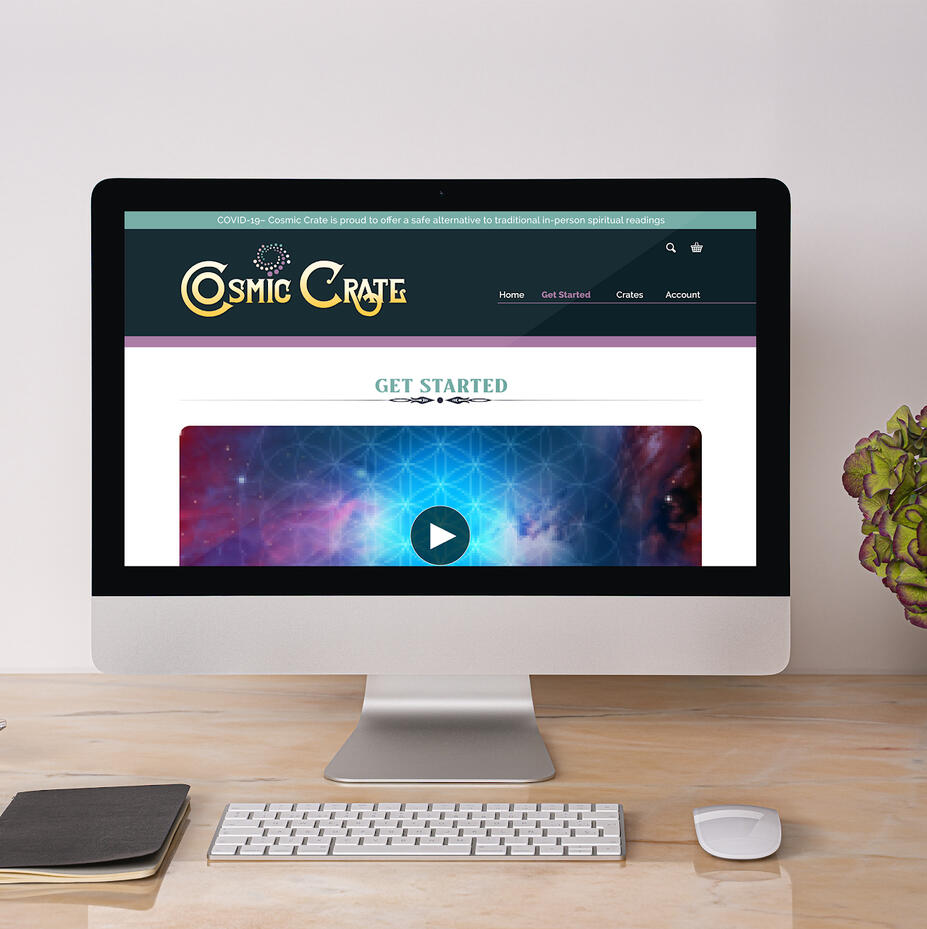
Website Design
Art Gallery

Warmth

Yello Fern

Speak No Evil

Fireball

Nissa Pi

Galaxy

Expanse

Angella Summer Namubiru

Afro

Crow sketch

Soft Character

Merlin and Hunith

Little Red

Bedroom 1 Sketch

Landscape sunset

Landscape sunrise

Sethen and Levi

Princess
Insomnia

Sethen & Elen

Sethen & dad

Canes

Where Spirit meets the Land

Outfit Design 1#

Island Design 1#

Jane & the Dragon

Dreamlike

Howl's Moving Castle

Young Warrior

Lady Elenour

Tearful variant

The Great Homecoming

Mother Mother

City investigator

Raven Waress

Where is your Rider?

Untitled

Untitled

Untitled

Untitled

Untitled

Untitled

Untitled

Untitled

Untitled

Untitled

Untitled

Untitled

Untitled

Untitled


Classical Book Jackets


Beowulf
J. R. R. Tolkien
For the design of the first book, one theme that seemed to blare in my head was broadway musical, which inspired the title design, looking slightly like a light-up sign, after that, I added Beowulf and his city behind him.There weren't many illustrations of Beowulf that I could find, that fit the image I was looking for, but The Witcher had recently come out, and as such, I inspired the look after the main character of the show, Geralt.Later I added stars to sprinkle around and lines to make it seem like hanging stars in a theatre. Lastly, I played with the border by placing the sword in front of it, instead of behind, just to add another depth element to the whole design.
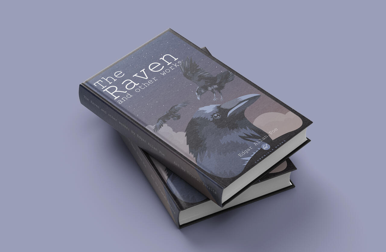
The Raven and other works
Edgar Allen Poe
For the design of the second book I hadn't been certain which poet I wanted to design a book for, and in the end, settled on E. A. Poe.I chose one of my favorite animals, and poems to feature on the cover, the Raven. I found some pictures of crows and den recreated them in a block color style, keeping it simple in shape, but complex in color shading, I also wanted to keep the element of depth so I placed clouds behind them and a starry sky after that. On the back cover, I placed a simplified moon shape and a crow flying over the border.
Pride & Prejudice
Jane Austen
For the design of the third book, I decided to go with a softer, and more minimal style than the one I chose for the previous two. I chose instead to use an outline style and used a scene from the movie as inspiration for the cover design.Unlike the previous two that had specific designs on the back from the front moving to the back, this one just kept the main design solely on the front, just to emphasize the minimalist design, so the back only had stars put around the paragraphs. Meanwhile, the front cover has Elizabeth and Mr. Darcy embracing with Elizabeth placing a kiss on the back of Mr. Darcy's hand, a reference to the iconic scene in the movie where they both finally reconcile.
Final Designs

Beowulf Design

Beowulf Design

Beowulf Design

Beowulf Design

Raven Design
Raven Design

Raven Design
Raven Design

Pride & Prejudice Design
Pride & Prejudice Design

Pride & Prejudice Design

Pride & Prejudice Design


Initial Ideas
The beginning of this design was stemmed from wanting to create a musicale styled cover for Beowulf, with a glowing sign title, and stars hung on strings, bringing the fantasy and magic of the original story to a brighter aspect than the dark one of the original. Though as I added more covers to the series I found that the musicale style didn’t quite fit all of them, some matched a more dreamy and soft style, like Pride and Prejudice, or needed a darker and serene style like The Raven. Though originally the sketches were truer to the originals, Beowulf having an intricate and fantastical border and a more adventurous or dangerous cover, The Raven more morbid and dark, and Pride and Prejudice too vague and subtle.
About Project
Target: 15-20s year-olds, book readers
Style: Broadway, starry, simple, dreamy
Insp: shag art, flat/outlined illustrationLiterature and poetry have always been a big part of my life growing up, with reading proverbs from the bible, to the classical poetry that everyone knows, and finally later obsessively reading anything that fell into my hands, as such I thought it only prudent that I do a project on one of my favorite subjects.This is a personal project that I’ve done over the span of two years. Currently up on the list are: Beowulf, The Raven, and Pride and Prejudice.With the design for this, I wanted to keep it consistent throughout all the designs, in subtle and clear ways. Firstly was creating a border that would encompass each design inside. Secondly was a texture that would lay on top of the entire design. Thirdly, it was starry skies, and sunset, dusk, and sunrise gradients. Lastly, each design, for both back and front covers, had its own style and unique colors that blended and worked with the background.

Artwork
Ink Paintings
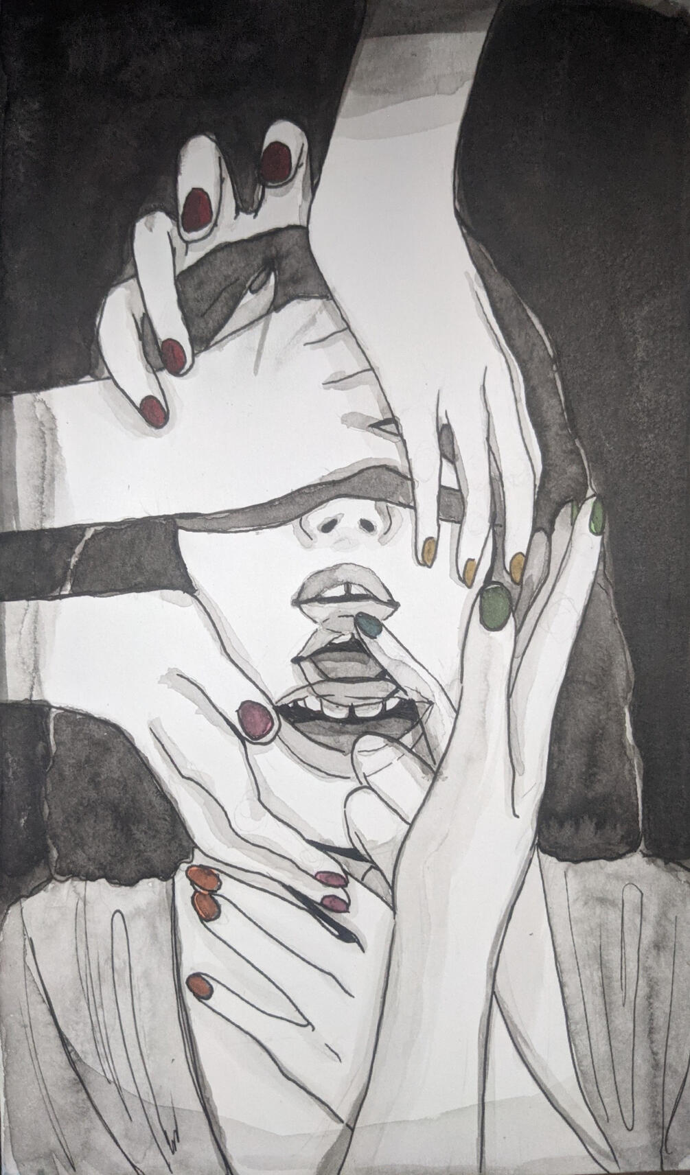
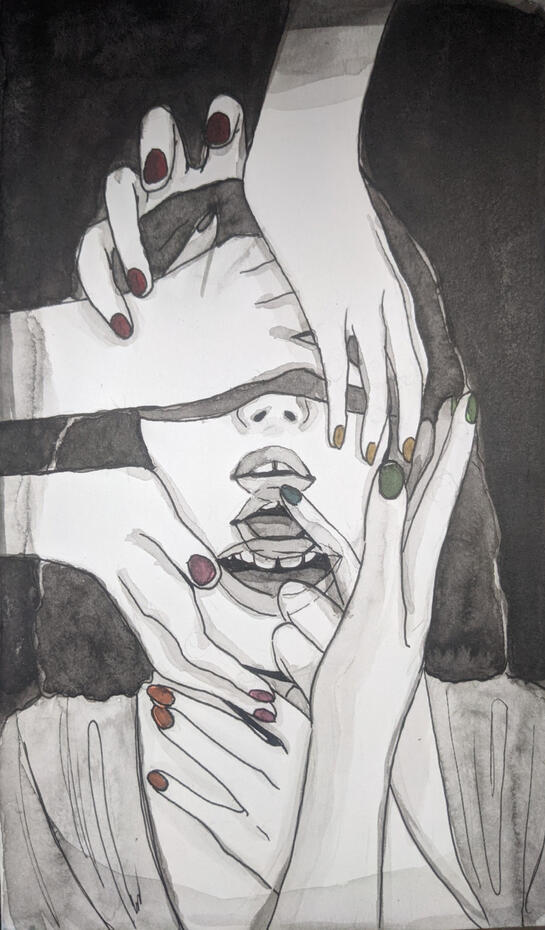
Asphyxia
The inspiration for this project was from a situation of abuse that happened to me many years ago, I wanted to be able to draw all the feelings that I had felt all those years ago, so I took the time first to write down what emotions I remember feeling at that time, after that, I took a series of photos of myself in poses, and then edited images to layer on top to be able to see the rest of what I was imagining. After that I used water, India ink, and brushes to lay it all out, afterward outlining everything.
To start with, the figure is blindfolded, to make clear that they could never truly see what was going on (A euphemism for innocence). The mouth is shown to open to maybe speak or shout, but fingers reach up to shush them (A reference to my inability to speak about what happened). The hands are small and dainty and seem even gentle, but they hold the figure in place firmly, a deception that wasn't expected. It all pushes a lack of senses and perception, and finally, the abuse of trust.
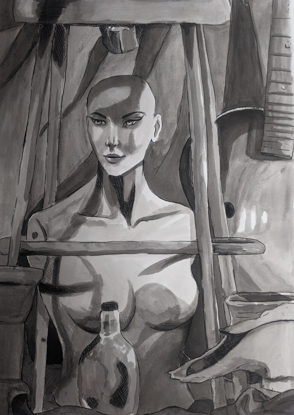
Trapped
This painting had been done during my time at Valencia College, I had taken a bunch of items in the art room and put them all together to make it look like an old attic, with plenty of clutter and miscellaneous items and a curtain as a backdrop.
During this time I remembered watching Toy Story 3, and that feeling that the toys must have felt when being left in the attic started pushing me to make it feel cluttered and suffocating. Later putting the mannequin underneath the seat, an empty bottle in front of it, and items that seem useless, like the guitar with no strings (and this particular one also had no sound-hole), a cow skull, some empty pots, and cloth to scatter at the bottom.All of this pushed the whole painting to look tightly concentrated and filled with a meaningless feeling.


Sketches


Advertisement Design
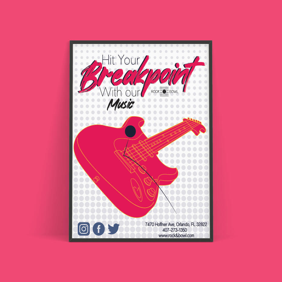
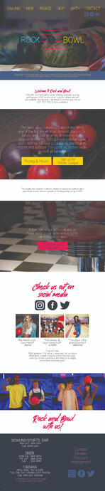
Rock & Bowl


Rock & Bowl Ads
The title phrase "Hit your Breakpoint with our-" was inspired by the bowling term breakpoint (which is the sweet spot when the ball starts curving to strike the pins).For the finalized design of my ads, I tried to keep one center of focus filled in with one of the brand colors and kept the rest of the design outlined. I kept the design very simple and minimal so that it could be a more responsive design.Each ad would be showcasing the facilities and renovations that were done to the Rock & Bowl building, which were: a renovation of the bar to have more rounded drinks for all ages, live music, karaoke along with the live music, grilled food at the restaurant, and obviously, the lanes.

Ad Lanes design

Ad Lanes design

Ad Music design

Ad Music design

Ad Food design

Ad Food design

Ad Karaoke design

Ad Karaoke design

Ad Drinks design

Ad Drinks design


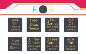
Branding

Logo
Business card front
Business card back
Letterhead
Website Home
Website Menu
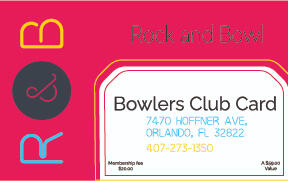
Club card front
Club card back

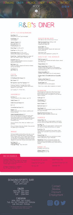
Menu front

Menu back


Initial Ideas
The 70s and 80s disco designs inspired the beginning of this design, most of the brand and ad designs were focused on patterns and geometric shapes, also adding bright and saturated colors to the shapes made the designs become cohesive with the inspiration and initial designs. After figuring out the brand, I came up with four ad ideas and created three designs for each idea, I chose the ones that could show off the facilities of Rock & Bowl best.
About Project
Target: All ages, children, couples
Style: Graphic art, pop art
Insp: Comic art, 70s & 80s discoRock & Bowl had been a rebranding project inspired by the 3 Point Bowling brand, which later branched into an advertising campaign.

Terms of Service
♡ Any commission that violates these terms will be canceled. I have the right to refuse commissions I choose.♡ Finished pieces might be posted online. If the client wishes the artwork to be kept private, please specify, and it will be held confidential.♡ The artwork process time is subjective, depending on the circumstances of the artist. (i.e Emergencies, Academics, Vacations, etc.) So there is no absolute deadline/date that the client will receive the artwork. However, an ETA (Estimated Time of Arrival) will be given.♡ Specific deadlines should be mentioned if one needs an artwork on a specific date.♡ Once the final payment is done, no refund is available.♡ Payments will be made through Paypal or Cashapp with USD.♡ Payments will be upfront, full payment. If paid half, the other half should be paid after the sketch and base colors have been finished. The painting and fully rendered artwork will be given after the full payment has been made.♡ You will receive the sketch, base colors, and in the process of painting as updates on the art piece. If you would like any changes, please specify at the sketch or base color stage. 3 changes max. If you would like more than 3 changes, there will be an additional charge.♡ If I will be designing a character for a commission, please understand if I ask for an additional charge.♡ NO ONE is allowed to sell my artwork.♡ No NFTs.♡ Paying means you have agreed to this TOS.
♡ Will make:
DESIGN: Logos, Branding, Posters. Book Designs, Product Designs, Branding & Design concepts, Illustrations.
ART: Male, Female, certain animals, humanoids, certain monsters/creatures.
♡ Won’t make:
DESIGN: Websites
ART: Mechanoids, Furry, NSFW
♡ Payment: Full or half payment upfront, USD payment through Cashapp or Artistree.♡ Please specify if you would like anything specific; lighting/animals/scenes/pose/expression/etc. It might change the final price.

About Me
Personal
Introvert or an extrovert?
Absolute Introvert! If you force me outside, I can't be responsible for what happens.
What is my family like?
I have a dad, a mom, three brothers, and two sisters. They are all quirky in their own way, annoying in their own way, and loving in their own way!
Along with them is my dog, and my sister's dog.
How about any kind of media (books, TV, podcasts, etc...) that has impacted you?
A large chunk of media that has impacted my life has actually been the Ghibli studio movies, they inspired me in my art, imagination, and self-expression, some of my favorites being Kiki's Delivery Service, Laputa: Castle in the Sky, and Howl's Moving Castle. Marvel, DC, and Disney have also been some of the best inspirations I've had.
My favorite season is...
Winter. I live in a tropical area... Winter
Professional
What motivates me to achieve my goals?
The determination to do what I'm passionate about, and what makes me happy. Also helping my family, and providing for them.
What impact do I want to have on the world?
I want to be honest about my belief, and how God has changed and impacted my life. I want to spread kindness, and honesty, and understanding of innermost genuine feelings.
Who inspires me?
My family has been the most inspiring to me, both creatively and professionally. I started art mainly due to my father, who was a hobby painter, and encouraged me to do what made me happy.
I can speak...
Both English, and Spanish (Español). I was born Spanish, but the skill has dwindled over my time in the states, I understand it perfectly, but I find it more difficult to respond without tripping over words, meanwhile, my English has been fluent.
My dream job is...
Freelance Illustration and Graphic Design. Book Illustrator, character design.

You can also contact me at any of my socials for any questions ♡